
The problem with dropdown fields (and what you should use instead)
Dropdowns are one of the default fields in the form design toolkit. But far too often, the dropdown is used in a way that makes user input more difficult. In this article, I’m going to talk about the advantages and disadvantages of using dropdowns, show you how to pick a better input method, and how to improve the usability of your dropdown inputs when there’s no other alternative. So let’s get to it.
Before I go any further, let’s take a second to talk about terminology. When I researched this article, I found there are a buttload of different names for dropdowns.
Here’s just some of the terms people use to describe the dropdown:
- dropdown (or “drop-down” if grammar is your thing)
- dropdown box
- dropdown menu
- dropdown element
- dropdown field
- selector
- select box
- select menu
- select input
- select element
Funny enough, the official name according to the W3C spec is “select element” and it’s probably the term people use the least.
Even more confusing, a lot of designers refer to navigation that expands when you hover or click on it as a dropdown menu. Which is whole other bag of UX shenanigans (maybe I’ll do that in a future article).
So just to make sure we’re all on the same page, this article is about this thing right here:
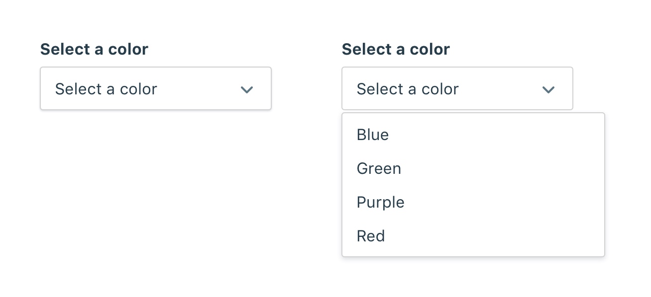
In this article, I’ll simply call it a dropdown. Though you can use any of the above terms your heart desires.
So let’s dive in.
What’s the deal with dropdowns?
On the surface, dropdowns seem like a great way to get user input. It can handle anywhere from one to an unlimited number of options, it’s compact, and it’s part of the default UI for web and mobile devices. Need a way to collect input from a user besides typing it out? Bam! Dropdown to the rescue. It’s like the Swiss Army Knife of input fields.
But with its versatility also comes usability problems. Much like an actual Swiss Army Knife, it can do a lot of things, but few of them well. The saw on a Swiss Army Knife is great for cutting firewood when you don’t have any anything else. But if I had a choice, I’d much rather have a chainsaw. I’d bring a Swiss Army Knife on a camping trip, but I wouldn’t use it to cut firewood in my backyard.
Dropdowns: pros and cons
The dropdown can sometimes be a great solution, but we have to look at the advantages and disadvantages to understand where we can best use it.
Advantages of using a dropdown:
- It conserves space. Dropdowns are great if you need to give a user options with very little space. The dropdown can be very small and can pack a lot of information in a small space.
- They’re standard inputs. That means you get all the benefits of a standard element including less debugging time, built in accessibility, and more predictable behavior.
- They allow you to collect predictable input. Collecting user input through a text field is unpredictable. Users can mistype, misspell, or misunderstand the input. By filling out and giving options to select from, you can collect more predictable input from users.
- They’re flexible. Don’t know how many options there will be? Just use a dropdown and it will adjust. One of the advantages of using a dropdown is that all the options are contained within the element. So you can design for any number of input options without having to change your design.
But you read the title of this article. You know we’re not here to sing the praises of the dropdown. So let’s look at some of the ways the dropdown fails.
Disadvantages of using a dropdown:
They’re more difficult to use
While dropdowns are easier to add to a design, they often create more work for your users. Zuko is a product that offers custom form analytics. In a blog post they analyzed the usage of dropdowns in forms across their customers. They write:
“While drop-downs may seem like a good way of housing content in web forms they actually cause a lot of issues.”
Similarly, the design team for the UK Government conducted research on using dropdowns for entering a date of birth. They write:
“People found this hard to use - it took them a relatively long time to find their year in the list.”
Luke W. also writes about the difficulty of using dropdowns in his article Dropdowns Should be the UI of Last Resort. In it he shares the findings of several usability studies comparing dropdown fields vs other input fields for inputting data on mobile. He summarized:
“Interacting with dropdown menus on mobile and the desktop is a multi-step process often requiring more effort than necessary.”
Users sometimes miss them
Another finding of the Zuko analysis was that users weren’t using dropdowns even when they were required fields in a form:
“Drop-down fields consistently appear high up in our client’s Most Corrected reports too. This report tells clients which fields their users revisited in order to correct data.”
In a research paper by Benjamin Healey, he found:
“drop downs led to higher item nonresponse and longer response times”
Why is that? Unfortunately the article doesn’t go into it, but we can guess why that is.
One possible reason is their size. We talked about size as an advantage, but it can also be a disadvantage. The downside of a smaller input is that it visually communicates “this isn’t important”. This can cause our brain to scan right over it and not register that it’s even there.
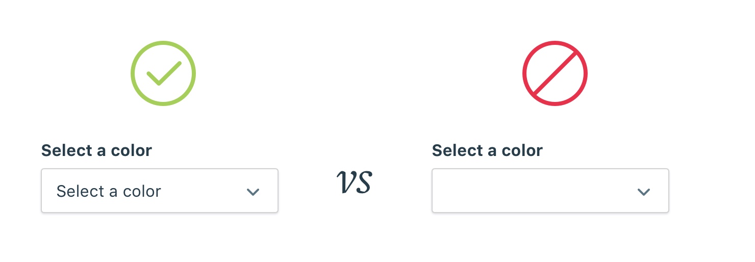
Another possible reason is that dropdowns look like they’re already complete. When users are filling out a form, they’re visually scanning for fields to fill out. It’s easy to pick out empty text fields, radio buttons, and checkboxes, because visually, they look empty. Compare that to dropdowns that look “filled” when they still need user input:
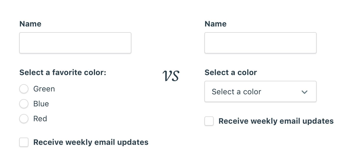
We could solve that by leaving the dropdown blank by default so it looks “empty” too. As we’ll see in the section about dropdown best practices, blank dropdowns aren’t recommended for good accessibility.
They hide available options by default
Another strike against dropdowns is they hide the available options by default.
In a meta research study by J.A. Bargas-Avila and colleagues, they analyzed studies showing the advantages of using radio buttons over dropdowns:
“Miller and Jarret (2001) see the advantage of radio buttons in the fact that all options are visible at once, whereas the advantage of drop-down menus lies in the saving of screen real estate.”
The limited space of a dropdown menu forces more interaction for the user to see and understand each available option.
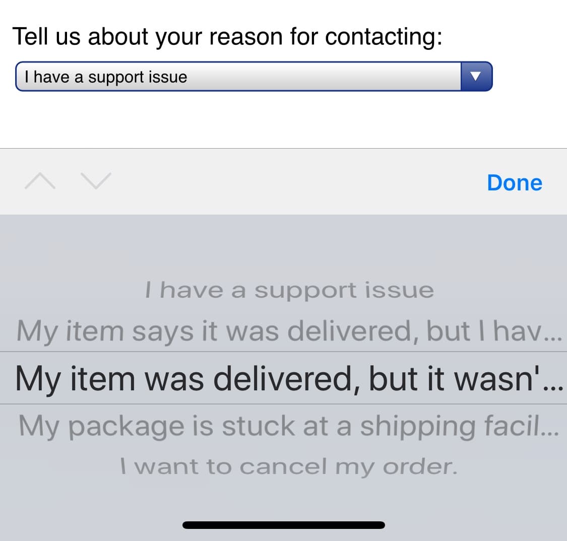
Also, if the dropdown has options that are more than 36 characters long, user won’t be able to even read them on some mobile devices:
They slow users down
In a usability study by CXL, they found dropdowns significantly slow down users compared to using radio buttons:
“Survey participants completed the radio button form (n = 354) an average of 2.5 seconds faster than the form with select menu buttons (n = 354). This was significantly faster at a 95% confidence level.”
No one likes filling out forms. The faster we can get users done with them, the faster they can get to the next thing.
Choosing the right input for the job
So with all the problems with the dropdown, how do we pick the right input to replace it? When is it a good idea to use a dropdown? Below are some examples of UIs with dropdowns and how they can be redesigned with a better option.
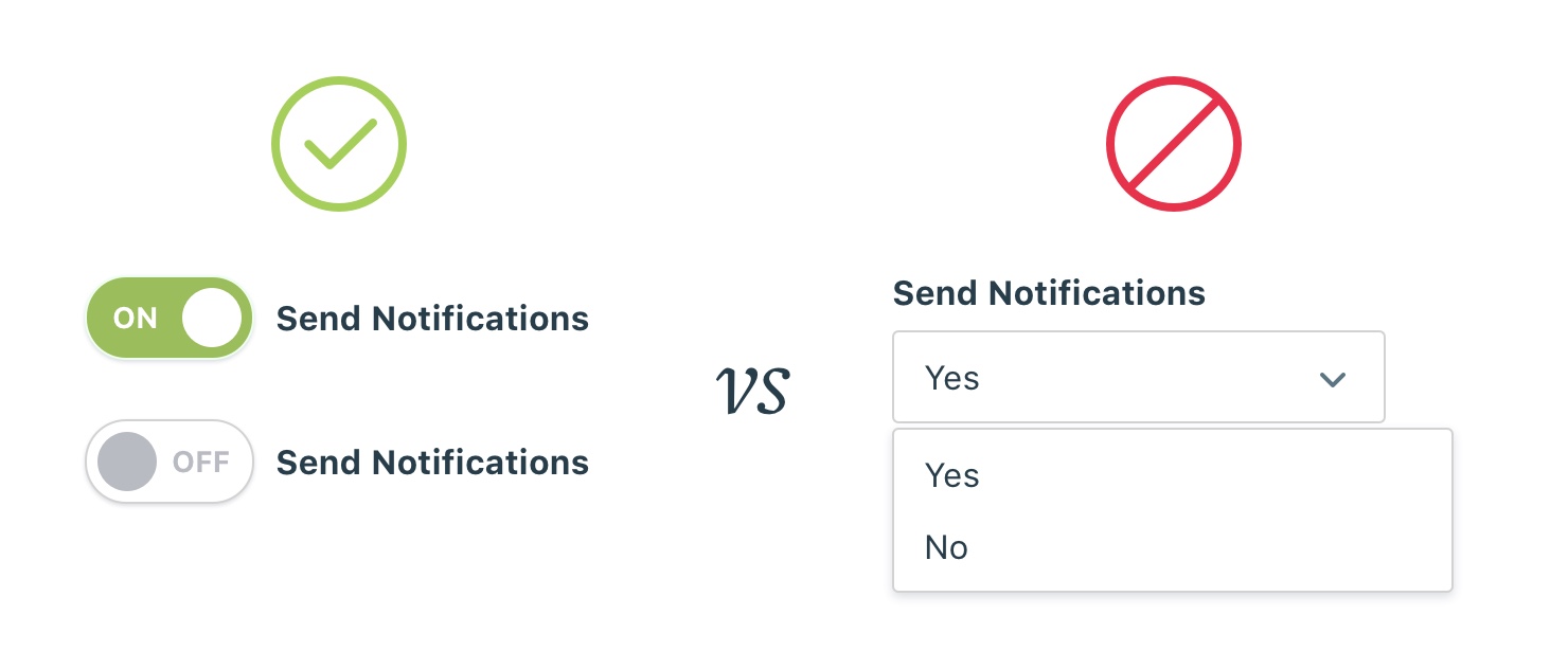
Switch / Toggle
If you have an input with two options, a switch/toggle can be used.
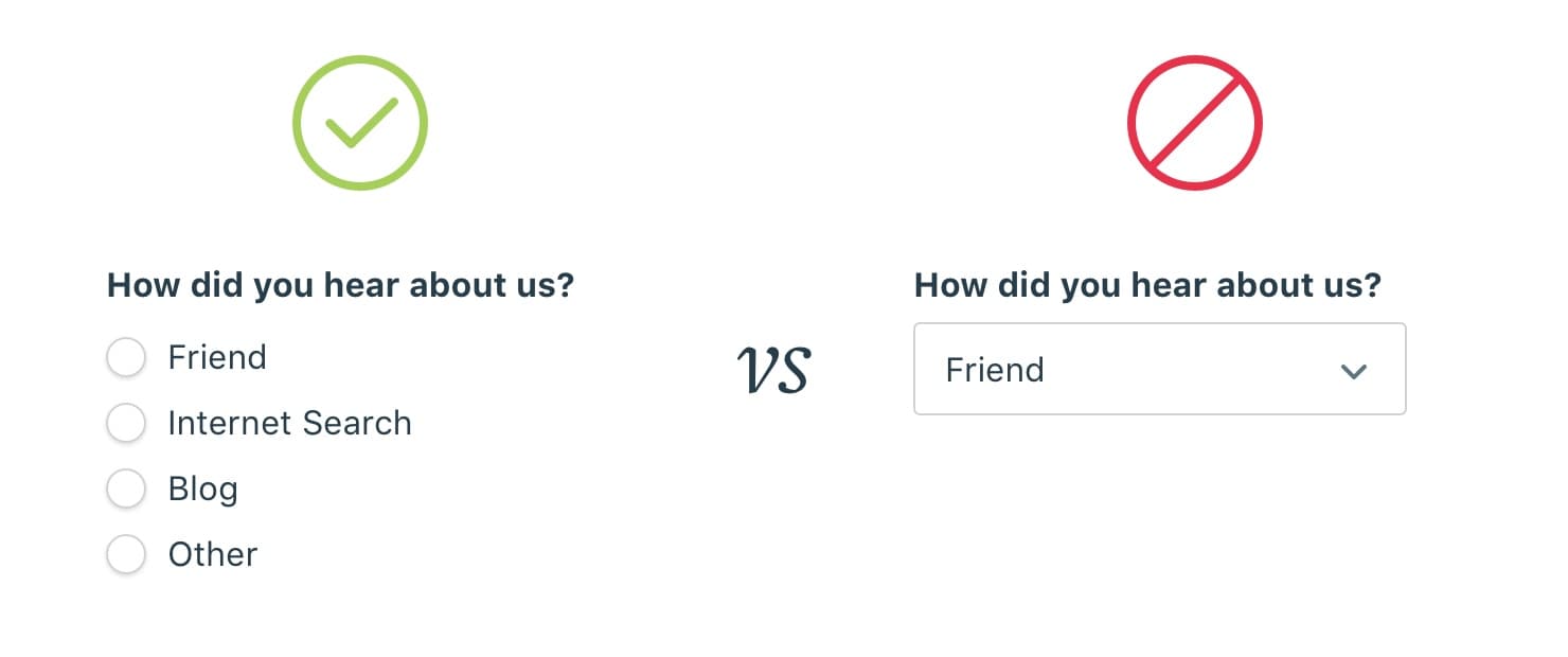
Radio buttons
Radio buttons can be used to replace a dropdown in most cases. The advantage of using them over dropdowns is that the options are easily scannable without forcing user interaction to view the available options.
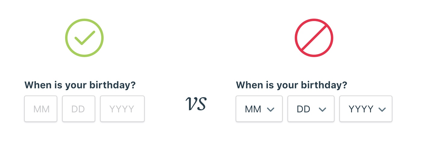
Text fields
Text fields are the preferred input when the user knows the input from memory or are following a set format.
Common examples:
- Birth date
- Credit card expiration date
Custom solutions
Some designers have avoided the problems with dropdowns by opting for a custom solution.
A great example is the country dropdown for Google Flights. It’s a great example of using the compact nature of a closed menu while expanding to a multi column list that’s easily scannable.
Another good example of a custom solution is a custom slide out panel. The team at Tradeshift were rethinking how they approached complex interactions and tested their solution against a dropdown and modals.
“We’ve found out, that compared to using a series of select elements and modal dialogues, this solution decreases the cognitive load on the user significantly.”
Check out the article for a good example of the thought process in choosing good inputs.
Best practices for using a dropdown
Sometimes it makes the most sense to use a dropdown. The most common cases are when there is limited space or an input is nonessential. Probably the most common example is sorting a list.

Here’s some best practices to make sure you’re using dropdowns well and avoiding some of its usability problems.
- Use descriptive labels. Use a label for the dropdown and a label for the default selection. Using a label outside of the dropdown is helpful for users to remember what the field is for when correcting mistakes. Using a descriptive label inside a dropdown is helpful for users with screen readers to make sense for the dropdown.
-
Sort options in a predictable way. It’s tempting to sort options by how frequently they’re picked, but listing options in a unpredictable way forces users to slow down. Stick with alphabetical in most cases and make exceptions when there are other predictable patterns (like days of the week).
-
Use short, descriptive options. Descriptions for the available options get cut off around 35 characters, so try to stick with options with shorter names or you’ll risk getting them cut off and becoming unreadable.
Just like most things in design, the best UI element will completely depend on the context it’s used in. Hopefully you’ll approach your next input field armed with a little more information so you can choose the right input for the job.