Confirm or undo? Which is the better option?
When designing software, you reach a point where you need to design actions that are potentially dangerous. In a couple accidental clicks, a user can embarrass themselves in front of their boss or wipe out hours of work. So how do you design so that doesn’t happen?
When designing software, you reach a point where you need to design actions that are potentially dangerous. In a couple accidental clicks, a user can embarrass themselves in front of their boss or wipe out hours of work. So how do you design so that doesn’t happen?
The most common solution is to add a confirm dialog and call it a day. If it’s important, the user will read the dialog and confirm that’s want they intended to do. Right?
Despite its popularity, using a confirm dialog is wrong in 90% of instances. Here’s why.
Problems with the confirm dialog
- It breaks the user’s flow. The idea behind the confirm dialog is that it allows the user to stop and think about their last action to make sure it’s what they intended to do. But the problem with interrupting the user is that it distracts from the flow of what a user was trying to accomplish. The dialog box forces them to stop thinking about the work they were doing to understand this new information.
- We habitually click confirm. We form hundreds of habits to help us on a daily basis. One of those common habits is when we see a confirm dialog, we try to close it quickly, despite what it says. The habit of closing dialog boxes quickly is even more prominent with the recent design trend to pop up a newsletter signup form for every damn blog on the internet.
- We don’t read confirm dialogs. Even when we read the text in the dialog, we don’t always take the time to stop and think about what it’s saying. If nothing stands out, we assume everything is good and click confirm because it removes the little box that’s blocking what we were doing. The main button in any confirm dialog is immediately thought of as the “keep doing what I was doing” button.
But it’s not enough to just say why you shouldn’t use confirm dialogs. So let’s go over why using undo is a better alternative.
The benefits of using undo
- It assumes the user knows what they’re doing. The main benefit of allowing the user to undo is that the interface doesn’t second guess the user. The interface does what it’s suppose to without asking the user if they’re sure.
- It doesn’t get in the way. By removing the dialog box and replacing it without an unobtrusive way to undo, the user can stay in the flow of what they were doing. It doesn’t present the user with a new interface they need to interact with.
- It invites exploration. Having the ability to undo is reassuring to users that they won’t break something. Many times I’ve heard from less computer savvy users that they don’t try out unfamiliar parts of an interface because they don’t want to ruin anything.
- It shows instead of tells. Sometimes users aren’t 100% sure their action does what they think it’s going to do. By performing the action and showing the result, it allows the user to see how the interface is affected and makes it easier to determine if it’s the change they wanted to make.
Using undo successfully
So if undo is the way to go, how do you implement undo in a way that makes sense? Let’s look at some of ways to use undo successfully.
-
Provide feedback. It doesn’t matter if users can undo an action if they miss what happened in the first place. Provide feedback so the user can see what changed as a result of their action. For example: sending a file to the trash in OS X has both a sound and a visual feedback.
-
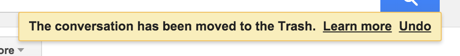
Make undo visible. Make the option to undo clearly visible. If deleting items is common, such as in a list, put the option to undo next to the deleted item. If undo is less common, a banner at the top or bottom of the screen can be a good option. Gmail does this well with an obvious yellow banner across the top of the screen.
-
Make items recoverable. Create a place where things go instead of deleting them right away: trash can, archive, outbox, etc. Trello uses this strategy well by archiving cards rather than deleting them. If a user wants to recover a card, they can go the archive and restore it to its original location.
-
Delay irreversible actions. If the action is something you can’t undo, delay the action. Gmail has an option to delay sending emails 15 seconds.
What if you can’t undo?
Sometimes there’s simply no other option but to use a confirm dialog. In those cases, it’s important to use a confirm dialog that will protect the user from making a mistake.
If you can’t undo, here’s some ways to design confirm dialogs that actually work:
-
Make dialog boxes uncommon. The best way to make dialog boxes more effective is to make them uncommon. As Alan Cooper writes in About Face:
Confirmations illustrate an interesting quirk of human behavior: They only work when they are unexpected. That doesn’t sound remarkable until you examine it in context. If confirmations are offered in routine places, users quickly become inured to them and routinely dismiss them without a glance. Dismissing confirmations thus becomes as routine as issuing them. If, at some point, a truly unexpected and dangerous situation arises — one that should be brought to a user’s attention — he will, by rote, dismiss the confirmation, exactly because it has become routine. Like the fable of the boy who cried “Wolf,” when there is finally real danger, the confirmation box won’t work because it cried too many times when there was no danger.
For confirmation dialog boxes to work, they must only appear when a user will almost definitely click the No or Cancel button, and they should never appear when a user is likely to click the Yes or OK button.
-
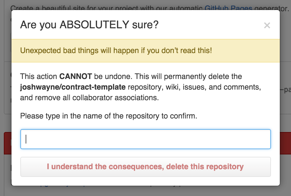
Make the confirmation unique. Make confirming an action something the user wouldn’t do often. Github does this well by making the user type the name of the project they’re deleting.
-
Make the action of the button clear. Have the confirm button say what it actually does rather than “Yes” or “Confirm”. You’re more likely to accidentally click “Confirm” rather than “Delete kittens.jpg”