Why you should allow users to see their password
You signup form is one of the first impressions users have of your app. After they read the marketing copy and decide your product is worth trying, chances are the first time they interact with your app is to sign up.
For years, every signup form had a couple fields like this:
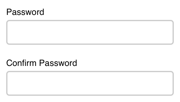
Users think of a password and type it into the first field. Then they go to the next field and type the exact same thing again.
I’m telling you right now, this design pattern needs to die. The confirm password field is a waste of time for your users, doesn’t do its job, and needs to be stop being the default for apps. Here’s why.
The idea behind the confirm password field was that some users mistyped their password when they signed up and were locked out of their account when they tried to log back in. So to fix this, designers added a second password field to double check the user typed what they meant to type.
This worked to help improve accuracy, but the confirm password field came with its own problems.
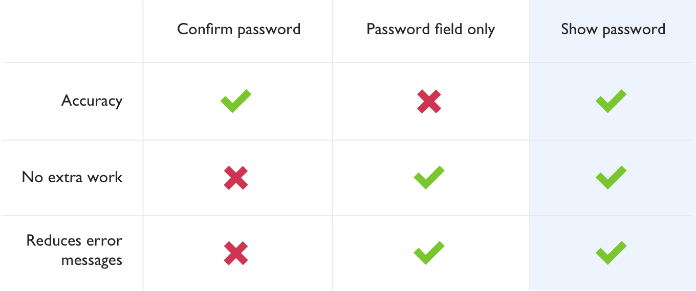
The first is that the confirm password field makes users do extra work. Only a small percentage of users mistype their password, but the confirm password field makes all users do extra work. If you want users to do something in your app, make it easier to do. This is especially important for the signup form because users have nothing invested in your app so far. This is their first impression of your app and they can easily walk away.
The other problem is that the confirm password field gives the user an error. People hate getting errors and will do everything they can to avoid them. Good interfaces avoid giving the user an error whenever possible and instead give users the opportunity to fix the problem before they get an error.
“So just remove the confirm password field?”
In many newer apps, you’ll see signup forms without a confirm password field.
This is slightly better. Now users can type their password quickly, but it doesn’t help with the original problem of accuracy. At least with the confirm password field, users knew if they mistyped their password and could correct it. Now they won’t know there’s a problem until they come back to log in and can’t figure out why their password isn’t working.
Instead, let users see what they typed
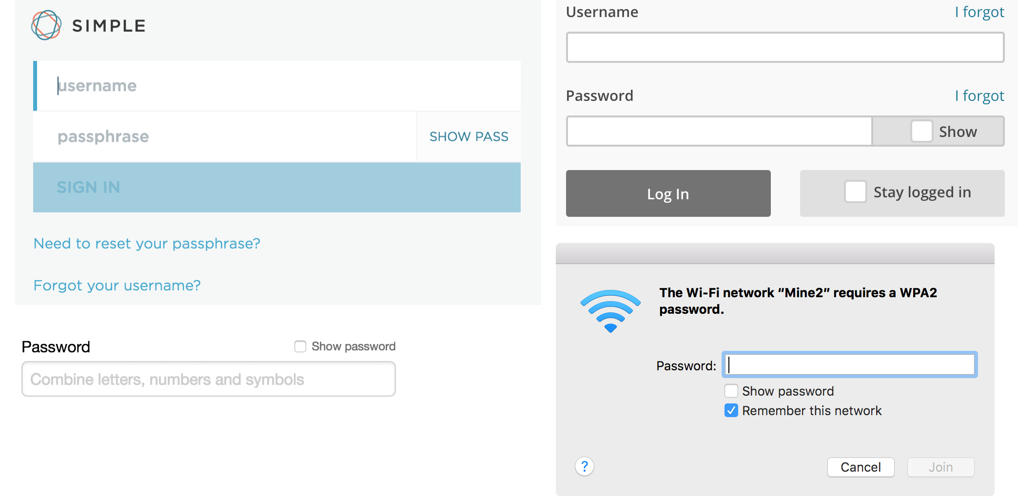
A better solution is to allow users to show their password to see what they typed:
See the Pen Show password checkbox by Josh Wayne (@joshwayne) on CodePen.
Adding the option for users to see their password is a better solution because:
- It reduces mistyped passwords
- Doesn’t make users do unnecessary work
- Allows the user to correct mistakes before submitting
Giving people the option to view their password allows them to check that they’ve typed what they meant to without forcing them to type it again. It also allows a user to type their password quickly and accurately, while also avoiding slapping the user with an error.
When using the show password design pattern, there’s some good and bad ways to implement it.
Patterns to avoid:
- Show by default. Showing the password by default might seem like the most user friendly solution, but user testing shows that when people saw the password shown by default, they believed it was a bug, the site was hacked, or the site isn’t safe.
- Show on focus. Showing on focus has the same problems as showing by default. It’s unexpected, and not in a good way.
- Using icons instead of labels. Avoid using icons to show and hide password text. Icons are almost never as clear as a simple label.
Patterns that work:
- Show password checkbox. The clearest option is to include a checkbox near the password field that allows the user to view the password field when checked.
- Show password link. Another option is to use a label that toggles from “Show” to “Hide” when the user shows and hides the password text.